Sample Issue
Tips, ideas, links, free images, and more
1. Free Original Backgrounds
Heavy Metal: Free Background Images
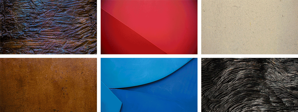
Want your next presentation to look unique? Well then, today’s your lucky day. I created this free series of widescreen background images just for you. The set is named Heavy Metal and comes from my original photographs of metallic surfaces and objects.
Click below to visit the Dropbox Showcase and view my sample slides that demo the backgrounds. Then scroll down from there to download any or all of the originals.
These are free original images that you can use and share with no copyright. Licensed under Creative Commons Attribution-ShareAlike 4.0 (CC BY-SA 4.0).
Go to Showcase2. Presentation Tip
Schedule Enough Time to Rehearse

Read through all of the advice for giving a successful presentation and there’s one recurring tip: always rehearse. Experts suggest at least one hour of rehearsal for each minute of a high profile presentation. Now in all likelihood you’re not giving a TED talk, so your mileage may vary. But it is undisputable that any presenter must schedule plenty of practice time.
3. Public Speaking
Parallelism: Powerful and Persuasive
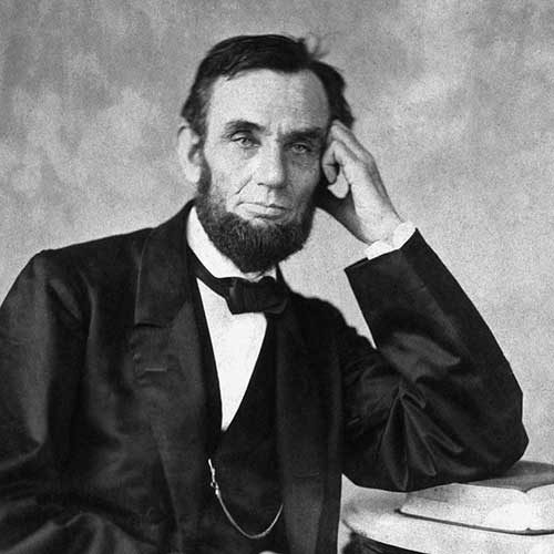
Abraham Lincoln once said, “You can fool all the people some of the time, and some of the people all the time, but you cannot fool all the people all the time.” Why is this saying so memorable? Note how the flow and repetition of the words add impact to his phrase. It is one form of parallelism (or parallel structure) and frequently used in speech and writing to emphasize a point or make an impression. And while it will take more thought and it may take more effort, it can take a presentation to a higher and more memorable level. See examples and learn more about parallelism.
4. Typography
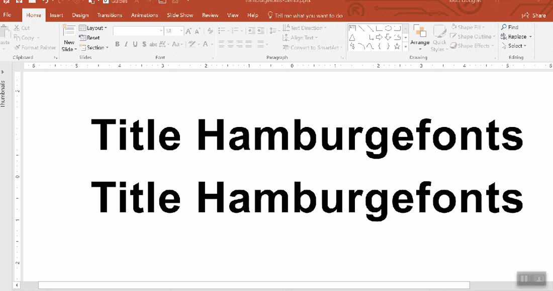
PowerPoint and Character Spacing
To some, PowerPoint’s handling of typography leaves much to be desired. But there is hope. A headline or title (like 48 points or more) can look cleaner and more readable on a large screen by using tighter character spacing. It is a subtle change for sure, but it elevates your design and appears more professional. And remember it’s best used on large type sizes for larger screens and not smaller body text.
So, how does it look? Why not subscribe?